Panel Cover
About
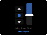
The cover panel controls a single cover entity (blinds, garage door, curtains, etc.). Open, stop, and close buttons are shown based on the features supported by the entity. A vertical position slider is displayed when the entity supports positioning.
Popup Variant
The popup variant (popup_cover) mirrors the main panel layout. It is used automatically when a cover entity is assigned as an item on another panel.
Controls
| Widget | Description |
|---|---|
| Up button | Opens the cover. Visible when the entity supports open. Disabled when position = 100%. |
| Stop button | Stops the current movement. Visible when the entity supports stop. Active only during opening/closing. |
| Down button | Closes the cover. Visible when the entity supports close. Disabled when position = 0%. |
| Position slider | Vertical slider (0–100%) for precise positioning. Visible when the entity supports set_position. Shows current position percentage above the slider. |
| Title | Displays the cover's friendly name. |
How to configure
In the panel editor, set:
- Item (entity picker) — A cover entity to control. Required.
Display Behavior
- Button visibility and enabled state are determined by the entity's supported features.
- When a cover is moving (state = opening or closing), the stop button is enabled.
- The position label shows
{position}%(e.g.,42%). - Slider interaction sends the cover position command with the selected value.