Panel Grid
About
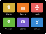
The grid panel shows up to 6 entities as large tiles in a scrollable layout. Each tile displays the entity name, icon, and state. If more than 6 entities are configured, a next-page button appears for scrolling.
This panel is a great starting point for grouping lights, switches, sensors, and scenes on a single screen.
How to configure
In the panel editor, add the entities you want to display as items. Each item uses the standard entity picker — select an entity, then optionally customize its appearance.
Per-Item Color Overrides
Each entity in the grid can have optional color and appearance overrides. In the Advanced section of the item editor, you can set:
| Option | Description |
|---|---|
| Text Color | Text and icon color for the tile |
| Background Color | Background color of the tile |
| Pressed Text Color | Text/icon color when the tile is pressed |
| Pressed Background | Background color when the tile is pressed |
| Power Button Color | Color for the power toggle button |
| Show Power Button | Toggle to show a power on/off button on the tile |
Display Behavior
- If more than 6 entities are configured, a next-page button appears.
- The panel remembers which page you last viewed and returns to it on revisit — this is automatic, not configurable.
- Tapping a tile opens the entity's default popup control (e.g., a light popup for a light entity).