Panel Light
About
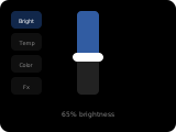
The light panel provides full control for a single light entity — brightness, color temperature, RGB color, effects, and power. Only controls for features the entity supports are shown.
Popup Variant
The popup variant (popup_light) mirrors the main panel layout. It is used automatically when a light entity is assigned as an item on another panel (e.g., tapping a light tile in the grid panel).
Controls
| Widget | Description |
|---|---|
| Power | On/off toggle button. Shown when the entity supports turn_on/turn_off. |
| Brightness Slider | Adjustable slider (0–100%). Shown when the entity supports brightness. |
| Color Temp Slider | Adjusts white color temperature. Shown when the entity supports color_temp. |
| Color Wheel | Tap-and-drag rectangular color picker. Shown when the entity supports rgb_color or xy_color. |
| Function Buttons | Up to 4 context-sensitive buttons below the main controls: effects, color mode, scene cycling, etc. |
How to configure
In the panel editor, set:
- Item (entity picker) — A light entity to control. Required.
- Show Kelvin (toggle) — When enabled, color temperature is displayed in Kelvin (e.g., 3500K) instead of Mireds (286 mired). Mired is the default Home Assistant unit. Default: off.
Per-Item Options (when used as a popup)
When a light panel is used as a popup from another panel, the parent entity's advanced settings can override:
- Icon — Override the light icon
- Name — Custom display name
- Background Color — Background color override for the tile
Display Behavior
- The title defaults to the entity's friendly name, configurable via the panel's title field.
- Controls automatically hide or show based on the light entity's supported features.
- When the light is off, sliders are disabled and the power button reflects the state.
- The color wheel always appears when RGB/XY color is supported, regardless of other features.